
Benjamin Tam
Independent Consultant
Mobile | .NET Core | Agile
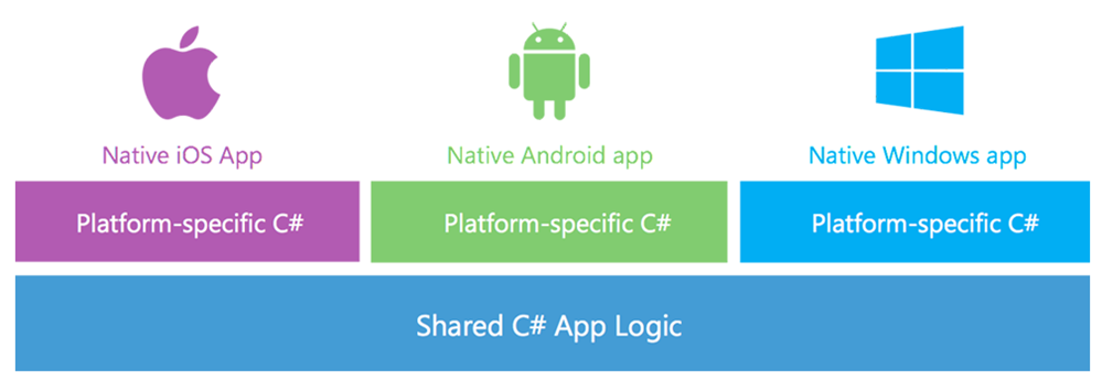
Xamarin often quote figures in the order of 70% for code re-use across iOS, Android and Windows applications. The illustration below, borrowed from Xamarin.com, demonstrates this conceptually.
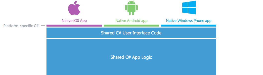
But what about Xamarin.Forms? Xamarin claim that now UI code can be shared across the 3 platforms, often 90% or an even higher percentage of code and be written once and re-used, depending on the exact nature of the application. Again borrowed Xamarin.com, the graphic below aims to illustrate this.
So how valid are Xamarin’s claims, or is this just marketing hype? Are the quoted percentages too good to be true? Are the figures reflective of the lines of code, time and effort spent or some other random metric? What does this look like in practical terms? Let’s explore a little.
For the purpose of this exercise, we will build a simple timesheet app inspired by a real project at Readify. We will define two user stories with acceptance criteria as per the below.
Before you can use Xamarin.Forms, you will need at least an Indie license. Alternatively, you can obtain a trial Business license.
So, let’s set up the building blocks for our test drive. Our solution should contain 4 projects: one for iOS, Android and WinPhone, and of course a common project that contains all of our shared code where all of the action will be located unless noted otherwise. The common project can either be a Portable Class Library (PCL) or a Shared Project, but for this exercise we will implement it as a PCL.
One final note before we proceed any further - this blog post does not aim to be a tutorial so implementation details will not always be described at length, but they will be mentioned if they are a little out of the ordinary. However, all code is available on GitHub so you can follow along or examine anything in detail should you wish to, with commits corresponding roughly to the flow of this blog.
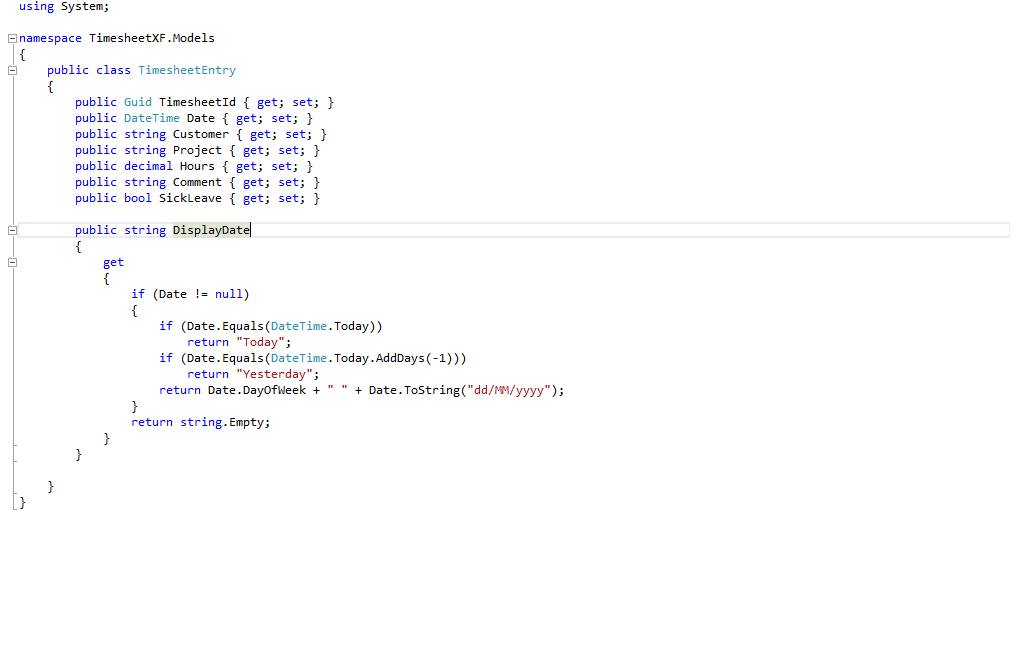
To model our data, we create a TimesheetEntry.cs class and put it under ‘Models’.
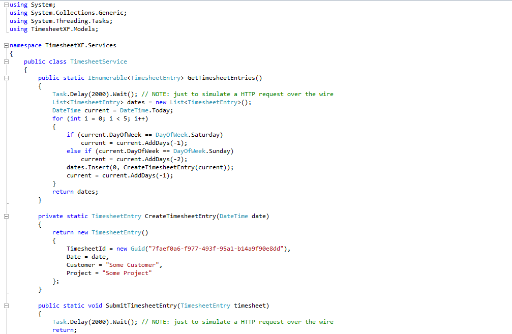
We create a service to handle the listing and submission of timesheet entries and put it under ‘Services’ like the below. Note that our implementation does not do anything like persist data - for the purpose of this exercise, we are aiming to do just enough to examine Xamarin.Forms in a meaningful way. So, our listing returns the same data every time and our submission won’t really save, but we make each method sleep for 2 seconds to simulate a call to an external data source over the wire.
We can now concentrate on our UI code to see if Xamarin.Forms can deliver on what it promises. With Xamarin.Forms, you can either work in XAML or code, and here we will work with the latter. Both arguably have their advantages, such as a better separation of concerns versus the current availability of intellisense in Visual Studio respectively.
Firstly, we create the outstanding timesheet list page using a ListView control. ListView works well without much effort, but because our user story has identified 3 fields to display, we need to create a custom ViewCell for it as the standard implementation of ListView only allows for 2 lines of text. Our custom ViewCell will contain a StackLayout of our 3 fields.
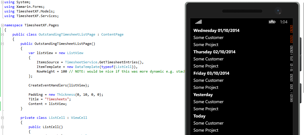
The timesheet list page was easy enough to create with the only hurdle being each ViewCell requiring a height value. Otherwise, Xamarin.Forms has been adept at calculating screen real estate to this point, although there is some variation between how the list looks on iOS and Windows Phone. In our example, a ViewCell height of 80 works better on iOS and 100 on Windows. The official Xamarin.Forms documentation does acknowledge the issue, so perhaps Xamarin will address it in the near future.
For the timesheet entry page, we will use a vertical StackLayout control for the overarching structure of the page, with a nested horizontal StackLayout for each label and field combination.
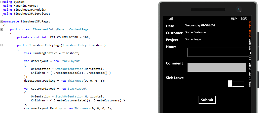
From my experience, the basic layout and functionality for this page was achieved without significant loss of momentum. However, in working with the controls, I discovered a number of quirks with them and so I did get bogged down occasionally. In the opinion of this author, some of these issues can arguably be expected, while others not so much. As alluded to earlier, spacing, padding and alignment exhibited some variance between devices, which can perhaps be excused especially by developers coming from a web background where catering for multiple browsers is the norm. However, LayoutOptions that can be used with the StackLayout control behave inconsistently and unexpectedly for a singular device, let alone when compared between iOS, Android and Windows platforms. For example, it was by trial-and-error to determine whether to use End, EndAndExpand, Fill or FillAndExpand for the LayoutOptions of the ‘Hours’, ‘Comments’ and ‘Sick Leave’ input fields. In addition, the width of a label cannot be guaranteed with the developer only able to request a width, leading again to layout differences across devices. In hindsight, perhaps using GridLayout or rethinking the layout altogether would have been a better choice for this page instead of nested StackLayouts. When I get a chance to investigate the effect of GridLayout, I will update this post accordingly should there be anything pertinent to report.
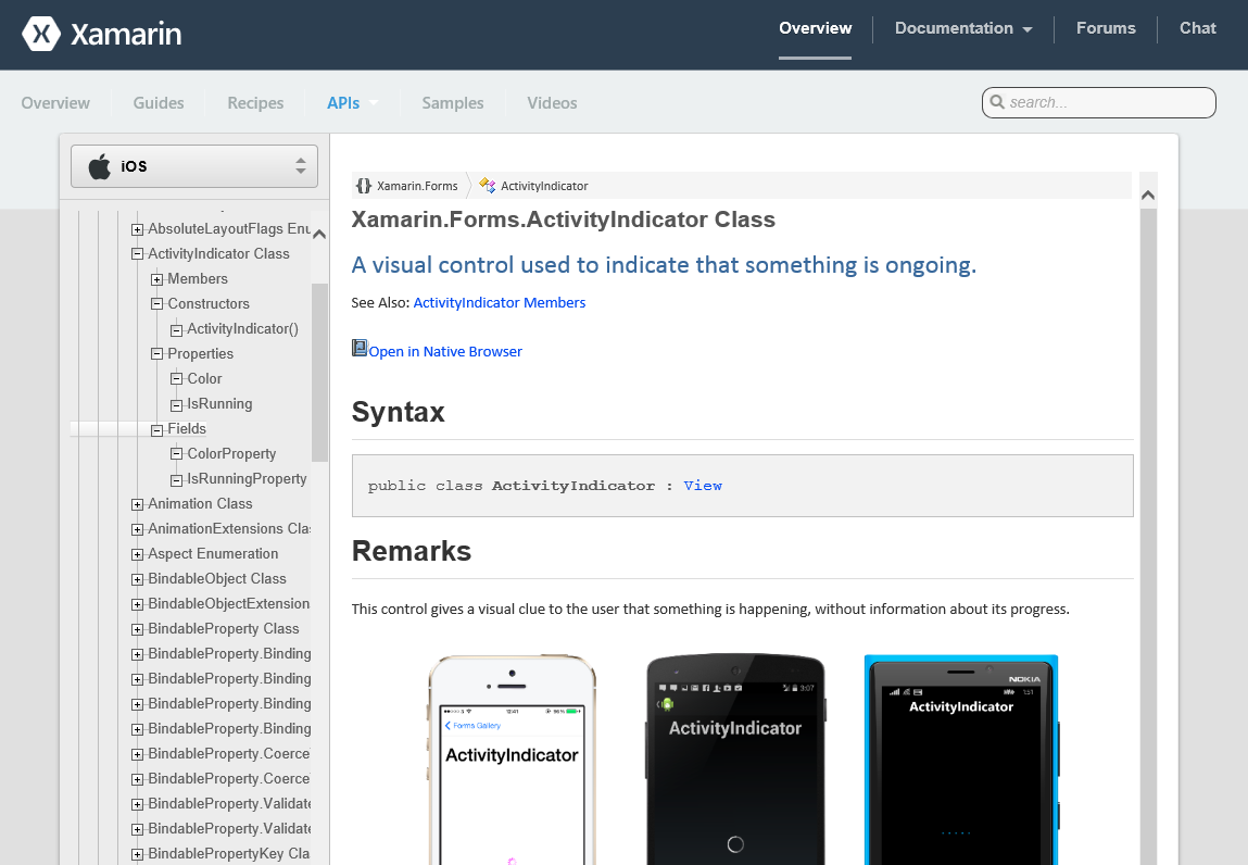
Things get even more interesting once the ActivityIndicator control gets introduced. While the documentation for the Xamarin.Forms control gallery is generally quite good, it is very sparse for the ActivityIndicator and does not provide any context or examples of how to use it.
So where to from here? For the live project that actually preceded this exercise, we inferred the path forward with the ActivityIndicator by reading between the lines of other Xamarin.Forms documentation, with prior experience of Windows Phone or WPF on the team making this process faster. The answer we eventually arrived at: MVVM. When doing this for the first time in the real world we appeared stalled on the ActivityIndicator for a while, but providing the user with visibility when something is loading remained an important feature for our product owner, and rightfully so.
To cater for MVVM, we add View Models (VM) to sit between the Views (V) and Models (M) that we already have. In our solution, we also rename the ‘Pages’ folder and namespace to ‘Views’ to match MVVM nomenclature. Note that there is some overlap of verbiage which can cause confusion, with Views referring either to Xamarin.Forms controls or the MVVM sense of the word. In addition, we use a Fody add-in (available via NuGet) to allow MVVM data annotations. However, another quirk discovered with Xamarin.Forms is that data binding of the Picker control is not yet supported.
Now that our solution has the MVVM building blocks in place, the ActivityIndicator is bound easily to the ‘IsLoading’ property in our ViewModels so it displays at the appropriate times. In our particular implementation, there is a ‘BaseViewModel’ with the ‘IsLoading’ property that other view models inherit from.
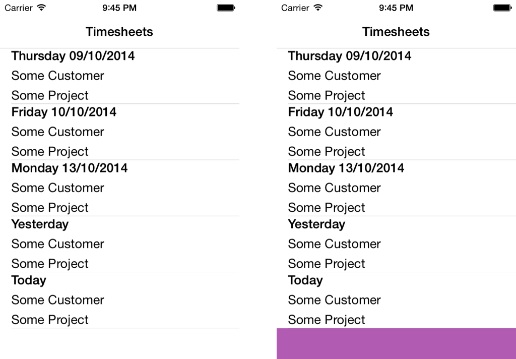
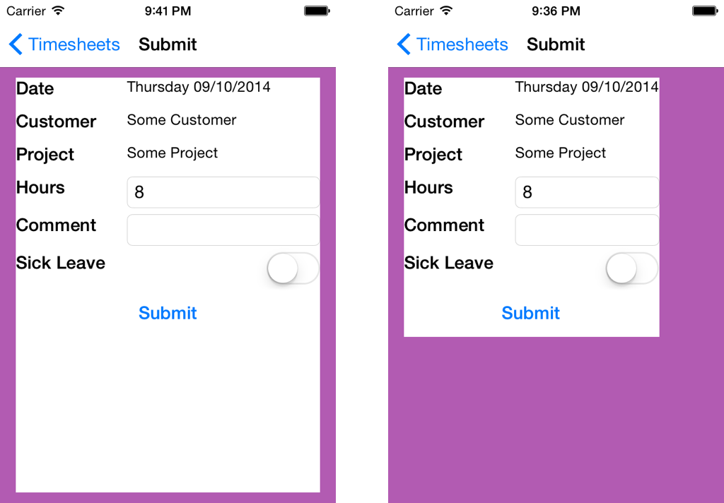
However, getting the ActivityIndicator to display, and getting it to display where you want it to is an entirely different story. Placing the loading indicator at the centre is a common design paradigm in apps, and so the first approach attempted was to overlay the ActivityIndicator using RelativeLayout with this in mind, and the second was to likewise try AbsoluteLayout - both yielded similar results. Despite there being no changes apart from overlaying the ActivityIndicator with either relative or absolute layout, the scrollable area on the listing page now gets cut off when the list is pulled down as if to refresh data on a typical app. Meanwhile, the alignment and padding on the entry page goes askew no matter which layout is used. In the series of screenshots below as displayed on the iPhone emulator, the affected areas described have been highlighted in purple.
To be fair, Xamarin do realise their layout controls need more attention and have been transparent about this.
In terms of sharing UI logic, Xamarin.Forms does theoretically deliver. In our simple example, we created zero platform-specific UI code and so any figures Xamarin quote in the order of 90-100% I would technically find believable.
However, whether such figures are meaningful in the real world is another story. Layouts are problematic to work with and is somewhat of a time-consuming, trial-and-error process, especially once they get nested. Chances are, significant time will be spent getting your applications to look consistent across devices too, but instead of developing platform specific UI logic, effort will be required to find solutions or workarounds for the controls provided by Xamarin.Forms. Other controls, such as the Picker or the ActivityIndicator, have yet to be implemented or documented properly respectively.
Overall, Xamarin.Forms undoubted has enormous potential, but I would suggest that it is not quite ready for production yet except perhaps for apps with reasonably simple layouts, prototypes, or if your product owner is flexible and does not require the app to be pixel-perfect. It will be very interesting indeed to see how it matures in the near future as Xamarin appear to be investing into this offering, and I have seen evidence of progress in the brief time I have worked with the technology. As such, despite present shortcomings, I am optimistic for the future of Xamarin.Forms and will be keeping a close eye on it.